Many brands spend weeks designing the perfect logo but forget about placement. Even the most beautiful logo can look awkward if stitched in the wrong spot. A thoughtful hat logo placement strategy1 ensures your brand stands out with balance, visibility, and confidence.
The best hat logo placement depends on brand goals2 and target audience3. Front-center placement offers maximum visibility4, while side or back placements create subtle, modern branding. For baseball caps, the logo should sit 1.5–2 inches above the brim. Balancing visibility, comfort, and production cost5 creates an effective logo placement strategy.

When I began designing hats for different clients, I realized that logo placement says as much about a brand as the logo itself. It affects how people notice, remember, and relate to your brand.
Why logo placement matters for brand impact?
I once worked with a sports team that placed its logo off-center as a creative experiment. Fans complained it looked “crooked,” and sales dropped. Placement shapes perception.
Logo placement influences how people read your brand identity6. Centered placements feel traditional and trustworthy, while side or back placements suggest innovation and exclusivity.

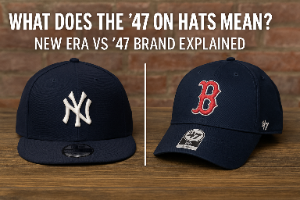
Human eyes are drawn to the hat’s front panel first, especially just above the brim. That’s why most recognizable brands — from Nike to New Era — stick with centered front embroidery. But modern brands often adapt, balancing familiarity with creativity.
Visibility and Impact Zones
| Zone | Visibility | Style Impression | Common Use |
|---|---|---|---|
| Front Center | Maximum | Classic, strong | Core logo branding |
| Side Panel | Moderate | Modern, subtle | Lifestyle collections |
| Back Strap | Low | Minimalist | Personalization or taglines |
| Under Brim | Hidden | Premium, surprise detail | Limited editions |
Placement is not just about being seen — it’s about being remembered in the right way.
Traditional front-center placement7 — still the most effective?
Most buyers expect to see the logo right above the brim. This placement delivers instant recognition and timeless balance.
Front-center placement remains the most effective for brand visibility and recall. It’s ideal for retail brands, sports merchandise, and promotional products that need immediate impact.

For baseball caps, the logo should sit 1.5–2 inches above the brim and be centered across the front panels. Embroidery on this area looks crisp because of the structured front support.
This setup also keeps logos visible from photos, shelves, and eye level — making it ideal for marketing purposes.
Front Placement Best Practices
| Hat Type | Ideal Placement | Notes |
|---|---|---|
| Baseball Cap | 1.5–2" above brim | Best for visibility |
| Snapback | Centered, slightly higher | Allows for flat brim balance |
| Trucker Hat | Centered on foam panel | Ensures contrast with mesh |
| Dad Hat | Slightly curved alignment | Matches relaxed style |
Front placements dominate because they align with how hats are worn, photographed, and perceived.
Exploring alternative placements8 — side, back, and under-brim?
When I worked with a luxury outdoor brand, they chose side placement for subtle branding. It looked modern, understated, and perfectly aligned with their minimalist identity.
Alternative placements — side, back, and under-brim — create unique branding styles that express creativity, exclusivity, or personalization.

Side placements attract attention from a different angle, ideal for lifestyle or streetwear brands. Back placements are perfect for personal monograms or taglines, while under-brim logos surprise customers with premium detail.
Comparison of Alternative Placements
| Placement | Visibility | Brand Effect | Best For |
|---|---|---|---|
| Side Panel | Medium | Modern, sleek | Fashion and youth brands |
| Back Strap | Low | Personal, custom | Corporate or teamwear |
| Under Brim | Hidden | Premium, collector appeal | Limited editions or collabs |
These placements can set your hats apart, but they require precise planning and higher embroidery accuracy.
Audience and style considerations
Different audiences interpret logo placement differently. A sports fan expects front-center. A streetwear buyer looks for creativity. Knowing your audience ensures your logo resonates.
Logo placement should align with brand identity6 and target demographics. Younger audiences appreciate unique placements, while corporate or heritage brands benefit from classic alignment.

For example, fashion brands like Aime Leon Dore often use side or back embroidery for a high-end, discreet look. In contrast, outdoor brands like Patagonia stick with large, centered patches for durability and visibility.
Placement Preference by Brand Category
| Category | Preferred Placement | Reason |
|---|---|---|
| Sports & Teams | Front Center | Visibility and recognition |
| Streetwear | Side or Under Brim | Creative individuality |
| Corporate | Front Center or Back | Professional consistency |
| Luxury / Fashion | Side Panel | Minimalist branding |
| Outdoor Gear | Front Patch | Durability and clarity |
Placement tells your audience what kind of brand you are before they even read the logo.
Production and cost implications
Some clients ask why their per-unit cost rises when they add a second logo on the side or back. It’s because every new position adds machine setup and extra stitching time.
Each logo placement increases embroidery setup, thread use, and production time. Multi-placement designs cost more and require higher precision.

A standard front logo usually involves one setup. Adding side and back embroidery creates two more setups, each adding to cost and lead time. Still, multi-placement branding can justify its cost through stronger visual presence.
Cost Overview by Placement Count
| Number of Placements | Setup Cost | Ideal Use |
|---|---|---|
| One (Front Only) | Base Price | Promotional or volume orders |
| Two (Front + Side) | +10–15% | Retail and premium brands |
| Three (Front + Side + Back) | +20–30% | Limited or collector editions |
Balancing visibility with production efficiency9 ensures your hats stay profitable and polished.
Testing placement through sampling and visual mockups10
Many brands skip testing, then regret it after production. One client realized too late that their logo placement looked off-center because of the hat’s seam curvature.
Sampling and mockups allow brands to test different placements, evaluate visibility, and confirm proportions before full production.

At Anthea, we provide digital visualizations and physical samples for every logo placement. This helps clients see how the logo interacts with seams, brims, and fabric textures before production begins.
Our Testing Process
| Step | Description | Outcome |
|---|---|---|
| Visual Mockup | Simulate logo placement digitally | Quick alignment review |
| Material Test | Embroider sample on real hat | Verify thread and tension |
| Comparison | Review side-by-side placements | Select best visual balance |
| Final Approval | Confirm design and cost | Prevents post-production errors |
Testing ensures your logo placement feels intentional, not accidental.
Conclusion
The best hat logo placement strategy1 depends on your brand identity6, target audience3, and product purpose. Front-center placement builds recognition, while side or back placements add creativity. With Anthea’s expert consultation and sampling, you can position your logo for maximum visibility4, balance, and brand impact.
-
Understanding this strategy can help you effectively position your brand for maximum visibility and impact. ↩ ↩
-
Exploring brand goals can guide your logo placement decisions to align with your overall marketing strategy. ↩
-
Knowing your target audience is crucial for making informed logo placement choices that resonate with them. ↩ ↩
-
Discovering techniques for maximum visibility can enhance your brand’s recognition and recall. ↩ ↩
-
Understanding the cost implications of logo placement can help you budget effectively for your branding. ↩
-
Exploring the connection between brand identity and logo placement can strengthen your branding strategy. ↩ ↩ ↩
-
Learning about the effectiveness of front-center placement can enhance your logo’s visibility. ↩
-
Investigating alternative placements can open up creative avenues for your brand’s identity. ↩
-
Learning to balance these factors can enhance both your branding and operational effectiveness. ↩
-
Understanding the importance of testing can prevent costly mistakes in logo placement. ↩