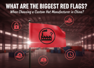
Many new brands lose money on their first custom hat order. Logos come out too big, colors look off, or designs don’t fit the hat shape. I’ve seen amazing ideas fail because of small, avoidable mistakes. Understanding the most common hat logo design mistakes1 saves time, cost, and frustration.
The most common hat logo design mistakes1 include incorrect sizing2, poor placement3, color mismatches4, overly detailed artwork5, and ignoring embroidery limitations6. Logos must be simplified, balanced, and scaled for curved hat surfaces. Testing with samples and following manufacturer guidelines prevents these costly errors and ensures professional-looking results.

When I first started designing for custom hats, I learned that even experienced graphic designers can misjudge proportions or choose colors that don’t work in thread. Let’s go through each common mistake and how to avoid it.
Sizing errors — when logos are too big or too small?
I once worked with a startup that ordered 300 hats before sampling. Their logo covered half the crown. It looked overwhelming and distorted after embroidery.
A hat logo should typically be between 2 and 2.25 inches high and no wider than 4 inches. Oversized designs distort on curved surfaces, while undersized ones lose visibility.

Many new brands design logos at screen scale, not real dimensions. Always print your logo at actual size and hold it against a sample hat. This test shows whether the proportions feel natural.
Embroidered stitches shrink slightly when tightened, so allow for that in your layout.
Logo Sizing Guidelines by Hat Style
| Hat Style | Ideal Height | Ideal Width | Notes |
|---|---|---|---|
| Baseball Cap | 2" | 4" | Balanced for front panels |
| Snapback | 2.25" | 4" | Works with flat crowns |
| Trucker Hat | 2" | 4.5" | Adjust for mesh tension |
| Bucket Hat | 1.5" | 3.5" | Smaller to match curvature |
| Beanie | 1.75" | 3.5" | Fits folded cuff area |
Proper sizing makes your logo readable and flattering, no matter the hat shape.
Placement problems — misalignment and awkward positioning?
I’ve seen logos stitched too low, too high, or slightly tilted — small issues that ruin the entire look. Placement consistency separates professional brands from amateur ones.
The best logo placement for most hats is centered on the front panel, about 1.5–2 inches above the brim. Misaligned embroidery causes uneven tension and unbalanced visuals.

Always use manufacturer templates or production mockups for guidance. Front panels differ between hat types, and placement errors often happen when digital designs aren’t aligned to the correct seam or curve.
Before bulk production, approve an actual stitched sample, not just a flat digital proof.
Common Placement Options
| Placement | Description | Use Case |
|---|---|---|
| Front Center | Most visible and balanced | Standard for brand logos |
| Side Panel | Modern, minimal style | Great for event hats |
| Back Strap | Subtle and clean | Best for secondary logos |
| Under Brim | Creative placement | Ideal for special editions |
Centered, consistent placement builds recognition and trust in your brand.
Color problems — poor contrast and mismatched shades?
A client once wanted navy embroidery on a black cap. It looked invisible under normal lighting. This happens more often than you’d expect.
Low contrast between thread and hat fabric makes logos disappear. Always test colors under daylight and indoor light, and use Pantone matching7 to maintain consistency.

Embroidery thread reflects light differently than ink. Metallic or glossy threads can shift tone depending on the angle. Always sample before production, especially when matching digital brand colors.
Simplify your palette — too many colors not only cost more but also reduce clarity.
Color Selection Tips
| Issue | Fix | Why It Works |
|---|---|---|
| Low contrast | Choose complementary shades | Enhances visibility |
| Too many colors | Limit to 4–6 max | Lowers cost and improves clarity |
| Inconsistent tone | Match Pantone to thread cards | Ensures brand alignment |
| Dull appearance | Test under varied light | Avoids surprises post-production |
Good color planning ensures your logo looks strong on every hat and under every condition.
Technical limitations — ignoring embroidery and print constraints?
A logo that looks perfect on screen may fail completely when stitched. Tiny text, thin lines, or gradients simply don’t translate.
Embroidery can’t reproduce gradients or ultra-thin details. Minimum line thickness should be 1mm, and text should be at least 4mm tall for clarity.
![]()
Designers sometimes forget that hats aren’t flat. Stitches curve, stretch, and overlap. Complex shading becomes patchy or distorted. Simplify shapes, bolden outlines, and use strong contrast for better definition.
When needed, use printing or patches for detailed logos instead of full embroidery.
Embroidery Design Checklist
| Limitation | Safe Practice | Result |
|---|---|---|
| Small text | 4mm height minimum | Readable at distance |
| Thin lines | 1mm+ thickness | Prevents thread loss |
| Gradients | Convert to solid tones | Cleaner finish |
| Overlapping shapes | Separate by color layers | Avoids distortion |
Good embroidery design starts with understanding how fabric and thread behave together.
Branding inconsistency — not adapting the logo for hats?
Some brands insist on using their full digital logo exactly as it appears on screen. This often results in poor legibility and off-brand impressions.
Logos must be adapted for hat embroidery. Simplified versions — called secondary marks — maintain brand recognition while fitting production limits.

A wide horizontal logo might look great on packaging but will stretch awkwardly on a curved hat. Create a stacked or icon-based version for embroidery.
Consistency doesn’t mean identical design — it means maintaining visual harmony across different applications.
Logo Adaptation Strategies
| Logo Type | Hat-Friendly Version | Benefit |
|---|---|---|
| Wordmark | Initials or monogram | Compact and readable |
| Complex emblem | Simplified outline | Cleaner stitch result |
| Gradient logo | Solid two-tone | Keeps impact and balance |
| Long horizontal | Square or circular | Fits crown curve naturally |
By adapting logos thoughtfully, brands stay consistent while maintaining production efficiency.
How Anthea helps brands prevent design errors?
I’ve seen countless new brands fix problems after wasting their first batch of hats. Our process at Anthea stops those mistakes before they happen.
Anthea’s consultation8 and sampling service9 helps clients test logo sizing, placement, color accuracy, and stitch behavior before full production.

We provide technical file feedback10, adjust digitizing for embroidery, and create pre-production samples to ensure everything aligns with your vision. Our clients avoid costly rework and gain confidence in their final products.
Our Preventive Process
| Step | What We Do | Why It Matters |
|---|---|---|
| Design Review | Check file for size, color, and readability | Detects issues early |
| Technical Setup | Convert to embroidery-ready format | Prevents stitch distortion |
| Sampling | Produce one test hat | Confirms final appearance |
| Final Approval | Aligns design with brand standards | Guarantees consistency |
Working with professionals ensures your first production run is smooth, efficient, and error-free.
Conclusion
Avoiding hat logo design mistakes1 comes down to preparation and testing. Keep your logo simple, size it right, match colors carefully, and always sample before mass production. With expert support from Anthea, your first hat launch will look professional from every angle.
-
Understanding these mistakes can save you time and money in your custom hat projects. ↩ ↩ ↩
-
Learn how sizing impacts the overall look and visibility of your logo on hats. ↩
-
Discover how placement can make or break the professional appearance of your hats. ↩
-
Explore the importance of color accuracy in ensuring your logo stands out. ↩
-
Find out how simplicity can enhance the effectiveness of your logo on hats. ↩
-
Understanding these limitations can help you create more effective designs. ↩
-
Explore how Pantone matching ensures color consistency across your branding. ↩
-
Discover how expert consultation can streamline your design process. ↩
-
Find out how sampling can ensure your final product meets expectations. ↩
-
Discover how this process can prevent costly mistakes in your designs. ↩