Many new brands struggle to make their hat logos look clean and clear when embroidered. Curved surfaces and rough fabric1 often distort fine details and ruin the design. I faced this problem too when I first started designing for headwear.
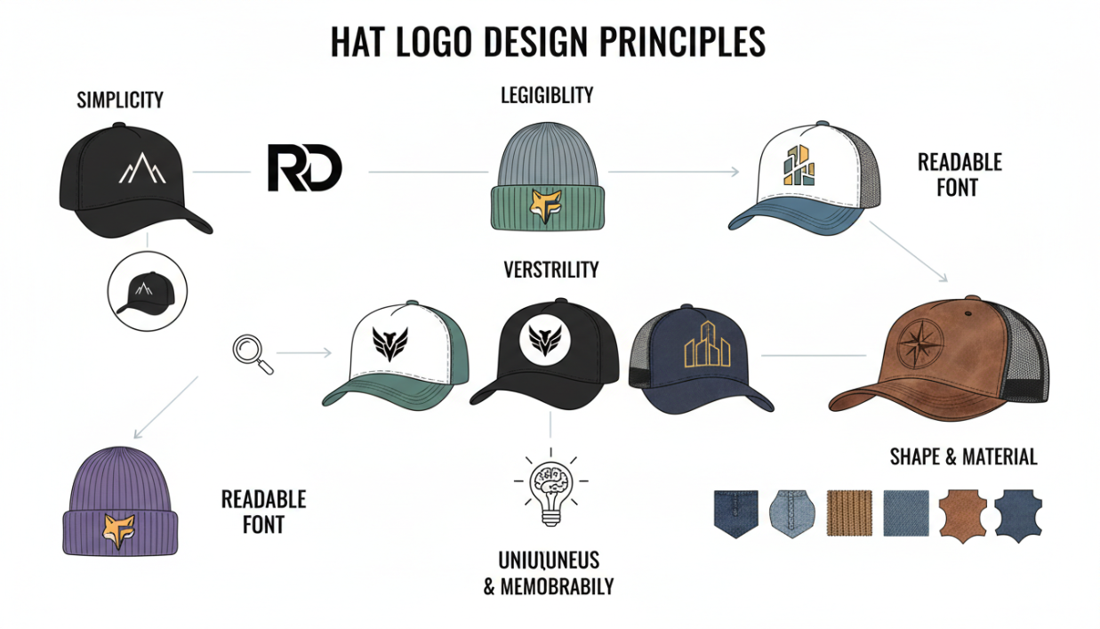
Effective hat logo design principles focus on simplicity, visibility, and scalability2. A clean logo should use bold lines, clear shapes, and limited colors3. It should stay sharp on curved hats and textured fabric4, keeping the brand recognizable and professional in every style.
![]()
When I learned to simplify and scale my logos properly, my hats finally looked like real brand pieces. Let’s explore these key ideas step by step and see how to make your logo ready for every hat style.
How do you design a logo that looks good on a hat?
Many designers add too many details to their hat logos. Small shapes or thin lines get lost in stitching. I used to make this mistake until I realized the power of simplicity.
A logo looks good on a hat when it is bold, simple, and high-contrast5. The fewer details you include, the better it appears when embroidered or printed.
![]()
When I design logos for hats, I start with large shapes and thick lines. I avoid gradients and small text6. Instead, I test how it looks from a distance. A clear logo stands out on camera, at events, or on store shelves.
Here is what I focus on:
Key Elements of a Good Hat Logo
| Element | Why It Matters | Practical Tip |
|---|---|---|
| Simplicity | Keeps logo readable on embroidery | Remove tiny shapes and textures |
| Contrast | Helps logo pop on fabric | Use strong color difference |
| Line Weight | Prevents thread merging | Keep lines thick and bold |
| Shape | Works on curved areas | Center main shapes above the brim |
| Visibility | Ensures brand recognition | Test visibility from 1–2 meters away |
When you apply these ideas, your logo works better on any hat style — baseball, bucket, or trucker. It also looks cleaner in photos and videos, which is key for marketing.
Where should a logo be placed on a hat?
Even a perfect logo fails if placed wrong. When I first produced hats, I didn’t realize how placement changes perception.
The best logo placement on a hat is front and center, right above the brim7. This gives the highest visibility and keeps the brand message clear.
![]()
Different placements tell different stories. A front logo feels bold and confident. A side logo feels casual and creative. The back placement looks subtle and personal.
When advising small brands, I help them choose placements that match their identity.
Placement Options for Hat Logos
| Placement | Style Message | Recommended Use |
|---|---|---|
| Front Center | Classic and strong | Most brands and team hats |
| Side Panel8 | Trendy and subtle | Streetwear or influencer merch |
| Back Strap9 | Minimal and discreet | Sports or event giveaways |
| Under Brim10 | Hidden surprise | Creative or luxury brands |
A centered logo fits most use cases, especially for DTC brands starting out. Once you establish your style, experimenting with side or back placements adds character without losing recognition.
What size should a hat logo be?
When I started sampling logos, size was my biggest challenge. A design that looked perfect on screen often looked too big or too small when stitched.
The ideal size for a hat logo is between 2 and 2.25 inches in height11 for front embroidery. Size should adjust based on hat type to maintain proportion and readability.
![]()
Different hat types require small adjustments. Baseball caps have smaller panels, while trucker and bucket hats have more space.
I always print my logo at actual size before embroidery. This small test avoids many production errors.
Recommended Hat Logo Sizes
| Hat Type | Recommended Size (Height × Width) | Notes |
|---|---|---|
| Baseball Cap | 2" × 4" | Works best for structured panels12 |
| Trucker Hat | 2.25" × 4.5" | Adjust for mesh texture13 |
| Bucket Hat | 1.75" × 3.5" | Smaller area due to curved front |
| Rope Hat | 2" × 4" | Keep balanced above rope line |
These measurements are not fixed rules, but good starting points. Testing each design in real samples is the best way to get perfect results.
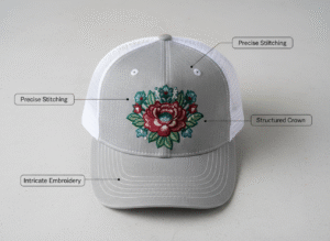
What makes a good embroidered hat logo?
Embroidery is not the same as printing. Many designers ignore thread behavior. I learned that fabric and thread thickness can change the entire look of a logo.
A good embroidered hat logo has bold shapes, clean edges, and limited colors. It avoids thin lines, small text, and overlapping gradients that distort during stitching.
![]()
Embroidery adds depth and texture. But it can also blur if details are too fine. I often work with suppliers to test different stitch densities14. The right density keeps the design crisp without breaking the thread.
Embroidery Design Tips
| Factor | Ideal Practice | Common Mistake |
|---|---|---|
| Stitch Density15 | Medium density for flexibility | Too high makes fabric stiff |
| Color Count | Use 3–5 colors max16 | Too many colors increase cost and confusion |
| Edge Clarity | Keep sharp, solid outlines | Fuzzy edges from overlapping thread |
| Font | Bold sans-serif fonts | Thin or script fonts become unreadable |
Choosing the right thread and adjusting spacing between letters also helps. Every hat fabric behaves differently — canvas, mesh, or twill — so testing is key before mass production.
How to apply custom hat logo design principles for your brand?
After working with hundreds of small brands, I realized that good design is not about fancy tools. It is about clear testing and feedback. Many startups skip this step and waste money on redesigns.
To apply custom hat logo design principles, use a simple workflow: design → mockup → sample → adjust → confirm17. Testing early prevents errors and builds brand confidence.
![]()
When I guide clients, we start with mockups and embroidery previews. We check size, placement, and color contrast. Once the sample passes, we move to bulk production.
Here’s the step-by-step process I follow:
Hat Logo Design Workflow
| Step | Description | Goal |
|---|---|---|
| 1. Design | Create vector logo with simple forms | Ready for embroidery |
| 2. Mockup | Place logo on digital hat image | Visualize placement |
| 3. Sample | Produce one or two test hats | Check real-world look |
| 4. Adjust | Fix color or stitch issues | Ensure clarity |
| 5. Confirm | Approve final version | Move to bulk production |
This process may take time, but it always saves money and stress later. Real samples tell the truth about your logo quality.
Headwear branding best practices for small apparel brands?
Many new labels underestimate how hats influence brand identity. A hat is not just an accessory; it is a billboard for your brand. I learned this when one client’s hat design doubled their sales at events.
Headwear branding works best when logo design, hat type, and color story align with your brand’s personality. Keep your visual identity consistent across all styles.

A minimalist streetwear brand may choose simple black caps with flat embroidery. A creative influencer might prefer bright rope hats with 3D puff logos. Both approaches work when they match the message.
When I consult small brands, I help them test different logo placements and finishes that best fit their audience.
Branding Alignment Tips
| Branding Element | Key Consideration | Example |
|---|---|---|
| Logo Style | Reflects tone of brand | Minimalist or bold design |
| Color Palette | Matches core identity | Neutral for classic, vivid for youth brands |
| Material | Supports function | Cotton for comfort, mesh for streetwear |
| Consistency | Builds recognition | Same logo style across hat types |
Testing logo effectiveness on multiple hat models before full production ensures each version supports your story and visual tone.
Conclusion
A good hat logo is simple, visible, and balanced. When design, size, placement, and texture work together, your brand stays strong and clear on every headwear style.
-
Explains why distortion happens on hats so you can design around fabric/shape limits and avoid ruined embroidery. ↩
-
Gives foundational rules to keep logos readable at small sizes and consistent across hat styles. ↩
-
Helps you choose design features that stitch cleanly, stay sharp, and reduce production issues. ↩
-
Practical techniques for maintaining crisp edges and legibility on real headwear materials. ↩
-
Learn how to maximize readability from a distance—great for retail shelves, photos, and events. ↩
-
Shows what embroidery can’t reproduce well, preventing wasted digitizing fees and bad samples. ↩
-
Placement guidance that boosts visibility and makes the brand message instantly clear. ↩
-
Helps match placement to style goals (streetwear, merch) without losing brand recognition. ↩
-
Clarifies when subtle branding works best and how it affects perceived premium/utility. ↩
-
Ideas for “hidden detail” branding that feels creative or luxury while staying tasteful. ↩
-
Provides a reliable sizing benchmark to avoid logos that look cramped, huge, or unreadable. ↩
-
Explains how cap construction changes stitch results so you can size designs correctly. ↩
-
Prepares you for common mesh challenges (pulling, gaps) and how to keep logos clean. ↩
-
Teaches the key setting that controls crispness vs stiffness—critical for pro results. ↩
-
Dial in a proven range to prevent stiff hats, puckering, and blurry detail. ↩
-
Keeps designs clear, reduces thread changes/cost, and avoids clutter that hurts readability. ↩
-
A repeatable process that reduces sampling mistakes and saves money before bulk production. ↩