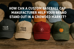
Many brands design great logos but struggle when putting them on hats. Oversized designs look unbalanced, while small ones disappear. I learned early that logo sizing makes or breaks a hat collection1.
The right logo size for hats depends on the hat type and decoration method2. For embroidery, keep front logos between 2–2.25 inches high and 4 inches wide3 for baseball caps and snapbacks. Bucket hats look best with smaller 1.5–2-inch-high designs4. Adjust size for visibility, fabric texture, and branding consistency5 across styles.
![]()
When I began working with product teams, I realized that choosing the right logo size is not just about looks—it affects cost, production time, and how people perceive your brand6.
What size should a logo be on a hat?
I’ve seen companies order hundreds of hats only to discover that their logos were too big for embroidery. They lost time and money because of a simple sizing mistake.
A standard hat logo size ranges from 1.75 to 2.25 inches high and up to 4 inches wide.7 This balance keeps your logo visible and neat on most structured front panels.
![]()
Before production, I always ask clients to print their logo at real size and hold it against the hat8. This test helps visualize proportions and avoid problems. Logos with small text or complex shapes should stay below 2 inches high9, while bold symbols can go slightly larger. The goal is to create a balanced look that matches your brand’s visual weight.
Recommended Hat Logo Dimensions
| Hat Style | Embroidery Size (H × W) | Printing Size (H × W) | Notes |
|---|---|---|---|
| Baseball Cap | 2" × 4" | 3" × 5" | Classic style with structured front |
| Snapback | 2.25" × 4" | 3" × 5" | Room for slightly larger design |
| Trucker Hat | 2" × 4.5" | 3" × 5.5" | Mesh affects embroidery sharpness |
| Bucket Hat | 1.5" × 3.5" | 2" × 4" | Works best with minimal logos |
| Beanie | 1.75" × 3.5" | N/A | Embroidery only, avoid fine text |
Keeping logo proportions consistent10 ensures that your design looks cohesive across multiple hat types.
What are the optimal logo sizes for different hat types?
Many clients ask me why their hat collection doesn’t look unified even when using the same logo. The answer usually lies in size adjustments for each hat style11.
Baseball caps and snapbacks usually look best with logos 2–2.25 inches high and up to 4 inches wide. Bucket hats and beanies need smaller 1.5–1.75-inch-high logos due to limited space and curvature.

When designing, I adjust logos by proportion rather than exact measurements. For example, a wide logo can stay 4 inches wide but shorter in height, while a circular emblem may appear more balanced at 2 inches total. Always test how the logo sits relative to the seams and the brim12.
Hat-by-Hat Breakdown
| Hat Type | Ideal Height | Ideal Width | Reason |
|---|---|---|---|
| Snapback | 2.25" | 4" | Flat front panel supports large logo |
| Trucker | 2" | 4.25" | Curved mesh needs smaller stitch area |
| Bucket | 1.5" | 3.5" | Limited front space, needs compact logo |
| Rope Hat | 2" | 4" | Balanced above the rope line |
| Beanie | 1.75" | 3.5" | Fits cuff or center front smoothly |
Testing across samples helps achieve visual consistency and brand balance in every style.
How does embroidery vs. printing affect logo size?
Embroidery gives texture and depth, but it has limitations. I once worked with a client who wanted a thin script logo embroidered, and the result was unreadable.
Embroidery works best with thicker lines and limited colors13. For embroidery, keep logos below 2.25 inches high. For printed logos, slightly larger sizes (3–5 inches wide) maintain sharpness14 without distortion.

Embroidery requires enough space for threads to form clean edges. Thin lines merge when stitched too small. Printing methods—like heat transfer or sublimation—allow finer detail and larger coverage, especially for promotional or sports hats. However, large prints may crack or peel over time, so finding balance between size and method is key.
Comparison: Embroidery vs. Printing
| Factor | Embroidery | Printing |
|---|---|---|
| Ideal Size | 2" × 4" | 3" × 5" |
| Detail Level | Moderate | High |
| Durability | Long-lasting | Medium |
| Cost | Higher for large logos | Lower for volume orders |
| Visual Texture | 3D effect | Flat and smooth |
Choose embroidery for premium branding, and printing for larger visuals or complex gradients.
How does logo size impact production cost?
One of the biggest surprises for new merch teams is how logo size affects pricing. I’ve had clients reduce their logo height by half an inch and save hundreds in stitch costs.
Logo size directly affects stitch count, thread time, and overall production cost.15 Larger designs take longer to embroider and increase unit prices.

Every extra inch of design area adds complexity. In embroidery, each 1,000 stitches can add noticeable time and cost. For large runs, even small size reductions make a big difference. Printed logos, by contrast, are priced by material area and ink coverage. Keeping logos balanced saves money while maintaining brand impact.
Cost Comparison by Decoration Type
| Method | Average Cost Impact | Key Factors |
|---|---|---|
| Embroidery | $0.10–$0.25 per 1,000 stitches | Thread density, logo size |
| Printing | +$0.05–$0.15 per inch² | Ink coverage, heat press time |
| Patch | Fixed per patch | Material and attachment method |
Balancing design size and visibility not only maintains a clean look but also controls your budget effectively.
Where should a logo be placed on a hat?
Placement matters as much as size. I’ve seen logos look great in the wrong spot and lose all balance.
The most visible and balanced logo placement is front and center, above the brim.16 Side logos should be smaller—around 1.5 inches wide—to stay proportional.
![]()
I usually guide clients to keep front logos within 2–2.25 inches high, and side or back logos under 1.5 inches. This rule keeps designs readable without overpowering the hat’s shape. Side placements work well for minimalist branding or secondary logos, while front placements carry your main visual identity.
Common Placement Options
| Placement | Recommended Size | Visual Effect |
|---|---|---|
| Front Center | 2" × 4" | Maximum visibility |
| Side Panel | 1" × 2" | Subtle, modern accent |
| Back Strap | 1" × 2" | Minimal, personal touch |
| Under Brim | 1" × 3" | Creative or hidden branding |
Choosing the right placement helps maintain harmony between design, proportion, and hat structure.
Expert recommendations for multi-style collections?
When managing multiple hat styles under one brand, maintaining a consistent visual identity can be hard. I’ve worked with fashion labels that used the same logo, but each hat looked slightly different because of inconsistent scaling.
For multi-style collections, adjust logo size by hat type while maintaining the same visual ratio. Keep width consistent and modify height slightly for each design.

I recommend creating a “hat logo size chart” that includes embroidery and print sizes for each product type. This guide helps marketing and product teams keep designs unified across campaigns. Anthea’s production process includes digital mockups to preview logo appearance before sampling—saving clients from expensive resizing later.
Multi-Style Consistency Chart
| Hat Type | Logo Height | Logo Width | Adjusted Ratio |
|---|---|---|---|
| Baseball Cap | 2" | 4" | 1:2 |
| Trucker Hat | 2" | 4.25" | 1:2.1 |
| Bucket Hat | 1.5" | 3.5" | 1:2.3 |
| Beanie | 1.75" | 3.5" | 1:2 |
| Snapback | 2.25" | 4" | 1:1.8 |
By using consistent ratios, your brand logo stays recognizable, whether on a bucket hat or a snapback.
Conclusion
Right logo sizing keeps hats balanced, visible, and professional. Following this hat logo sizing guide ensures your brand looks consistent and confident across every style.
-
See real-world examples of how sizing impacts balance, readability, and perceived quality across an entire hat line. ↩
-
Learn how different silhouettes and processes change what sizes actually work in production and on-head. ↩
-
Confirms standard sizing benchmarks so your front panel design looks centered, readable, and professional. ↩
-
Helps you avoid oversized bucket-hat logos and understand how curvature and space limit design scale. ↩
-
Gives practical guidance for choosing sizes that stay clear on different fabrics while keeping brand uniformity. ↩
-
Shows the business impact of sizing—so you can prevent delays, overruns, and “cheap-looking” results. ↩
-
Provides a reliable default range to start from when building tech packs or talking to decorators. ↩
-
A simple pre-production check that can prevent costly sampling mistakes and sizing surprises. ↩
-
Improves legibility by aligning your artwork details with what embroidery can realistically reproduce. ↩
-
Explains scaling rules that maintain a cohesive identity even when dimensions must change per style. ↩
-
Helps unify a collection by showing where one-size-fits-all sizing fails across silhouettes. ↩
-
Avoids awkward placements and distortion by accounting for construction lines and sightlines. ↩
-
Improves stitch clarity and prevents muddy details—especially important for small cap-front logos. ↩
-
Helps you choose print dimensions that stay crisp without warping or looking undersized. ↩
-
Lets you estimate pricing drivers and make size tweaks that save money without sacrificing impact. ↩
-
Backed by visibility best practices so your primary mark gets maximum attention and looks balanced. ↩